Sunday, July 17, 2011

Flow Chart

A flow chart is a type of mapping which lays out a sequence of events.  In this chart it shows a daily schedule for a school student but is also commonly used in project brainstorming.
http://frankley.school.nz/index_files/putting_the_pieces_together/thinking_maps.html

Saturday, July 16, 2011

Star plots

A Star Plot is a set of radii representing different variables.  The length of the radii represents the amount of the variable it represents.  This map compares several different car makers in 1979.

http://www.google.com/imgres?imgurl=http://datavis.ca/milestones//admin/uploads/images/starcrim2.gif&imgrefurl=http://www.datavis.ca/milestones/index.php%3Fgroup%3D1950%252B&usg=__g0xZKeTRUQpxqkVYEVG_xsAdGsk=&h=505&w=504&sz=9&hl=en&start=0&zoom=1&tbnid=HjdhiticvsQY5M:&tbnh=132&tbnw=132&ei=iE0iTuOcCpOrsALb66TVAw&prev=/search%3Fq%3DStar%2Bplots%26hl%3Den%26safe%3Doff%26biw%3D1600%26bih%3D722%26tbm%3Disch&itbs=1&iact=hc&vpx=853&vpy=75&dur=1757&hovh=225&hovw=224&tx=140&ty=98&page=1&ndsp=32&ved=1t:429,r:4,s:0

Correlation matrix

http://www.financialmodelingguide.com/analytical-tools/benninga-correlation-matrix/

In a correlation matrix finds within the data a number which compares the various relationships between data.  This map is comparing stock values of various companies.  Note the value of General Electric.  I bet many investors wish to see these numbers again.

Similarity matrix

A similarity matrix compares data to itself.  In this case the values are of a TV stream.

http://www.irit.fr/recherches/SAMOVA/pagesimilarity-matrix.html

Box plot

A box plot measures all of the different comparable numbers in scale in a simplistic yet complicated map.  The mean and median are measured in the straight line representing the range with variances and other measurements within the box.  This map measures the numbers of 40 smokers.

http://pirate.shu.edu/~wachsmut/Teaching/MATH1101/Descriptives/box.html

Histogram

 A histogram is a measurement of frequencies in a series of bars representing various ranges.  This map measures the profit ranges in an exercise for an excel training program.

http://www.vertex42.com/ExcelArticles/mc/Histogram.html

Parallel coordinate graph

A parallel coordinate graph measures different statistics on 2 scales through a line compared to the other values.  This particular graph measures the health care spending of nations and their life expectancy compared to other nations.  Its interesting to see that (at least in this study) there seems to be no correlation between spending and life expectancy. 
http://www.stat.columbia.edu/~cook/movabletype/archives/2009/12/healthcare_spen.html

Triangular Plot

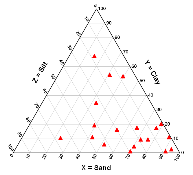
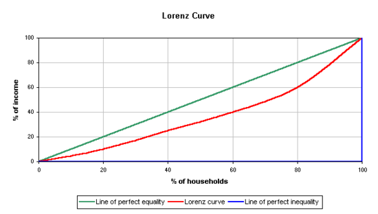
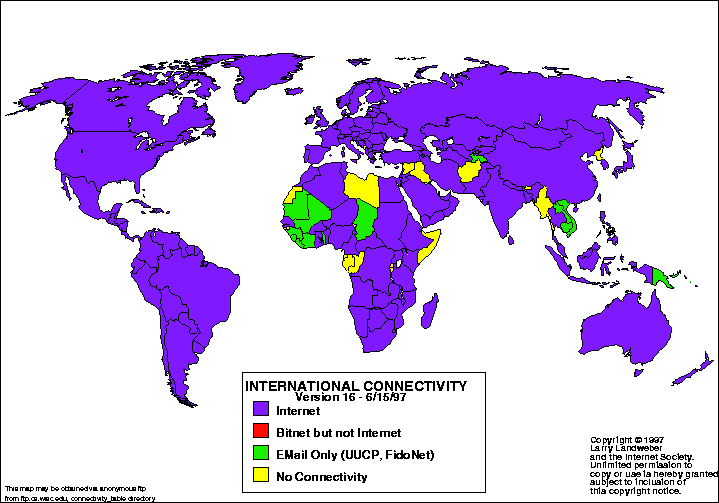
A triangle plot, as the name implies, measures 3 variables set into the points of a triangle.  The variables are represented from 0 to 100 percent along the sides of the triangle.  This soil texture analysis measures the amounts of sand, clay, and silt in a given measurement.  

http://www.dplot.com/triangle-plot.htm

Windrose

Much alike the triangle plot the wind rose measures just as its name implies, wind conditions.  The wind rose map is a valuable tool for many different occupations which need to track the different wind conditions over time to plan their future trips.  This map is a set of 4 measuring wind variances within a year stretching from September 1, 2004to august 31, 2005.

http://www.novalynx.com/reference-wind-rose.html

Climograph

http://wps.prenhall.com/esm_tarbuck_escience_10/0,6440,219574-,00.html

 A climograph measures precipitation and temperature in a given locations over a given period of time.  This map comes from a multiple choice test in a climate class and, although it is not labeled, it is understood that the measurements are in degrees F and feet of precipitation.  Although I am not a meteorologist I would say the answer would most likely be "arctic" since northern and southern hemispheres would get similar (and warmer) temperatures where the antarctic would get very little rainfall.

Population profile

 A population profile measures variances of a given population trend measured over time.  In this particular map the trend is age distribution over three decades.  This information could be used to compare the past trends to predict the future population numbers in decades to come.

http://www.co.nezperce.id.us/Departments/PlanningandBuilding/ComprehensivePlan/ComprehensivePlanHomePage/Population.aspx

Scatterplot

A scatter plot is a relatively simple expression of data which measures 2 sets of variables scattered at points across an x and y axis.  one only need to find the intersection of the points to understand the number represented. This scatterplot is a comparison of height and weight of different people.  The x represents the person's weight and the y their height. 

http://www.mathsisfun.com/definitions/scatter-plot.html

Index value plot

 An index value plot acts much akin to a line graph but instead of measuring independent variables it measures an indexed value.  This graph represents one of my favorite skeptical debates and measures searching for alternative explanations to ocean temperature increases.

http://www.skepticalscience.com/What-causes-short-term-changes-in-ocean-heat.html

Accumulative line graph or Lorenz curve

This Lorenz curve measures the distribution of wealth to the percent of the households.  The Lorenz curve (red) is the line of the measured value compared to the optimal (green) and bottom line (blue) values.

http://www.absoluteastronomy.com/topics/Lorenz_curve

Bilateral graph

 A Bilateral graph gets its name from the 2 directions it measures above and below a zero line.  This map measures the yearly returns on a particular stock share.  If you own this stock you should probably also invest in antacids because you are going to need them.

Nominal area choropleth map

http://www.stat.columbia.edu/~cook/movabletype/archives/2007/10/some_cool_graph.html

A choropleth graph measure geographic information.  The various colors help to easily distinguish the comparisons of the various locations.  The qualitative comparison of the nation in this map represents a simple conclusion (when compared to the other 3 maps on the website) that the richer members of the population tends to vote more republican.

Unstandardized choropleth maps

Unstandardized choropleth maps are maps comparing values of data with no nominal value associated to the different sections.  This map compares the distribution of ancestry throughout the United States but the data is just a comparison and lacking of any figures.
http://en.wikipedia.org/wiki/American_ancestry

Standardized choropleth maps

 Standardized choropleth maps are maps which compare different geographic differences much like their unstandardized relatives but they include the figures needed to accurately make an informed comparison of the distances between the variables.  This map measures the levels of poverty throughout the country.  One can get a better view of the how much of a difference exist between the different regions by the representations of the colors.
http://www.cdc.gov/pcd/issues/2007/oct/07_0091.htm

Univariate choropleth maps

A Univariate choropleth map, as the name implies compares only one single set of data throughout a map.  The below Univariate choropleth map compares the distribution of wealth throughout the country with the darker areas representing the areas more populated with wealthy people based on rental prices.
http://statgraphics.blog.com/page/2/

Bivariate choropleth maps

Bivariate choropleth maps compare 2 diferent varibles on the same map.  This map measures a comparison of the change in divorce rates in 1980 through 1990. 
http://www.blogger-index.com/feed385839.html

Pie Chart Map

http://www.acsu.buffalo.edu/~cconlee/Site.html
The Pie Chart Map gets its name from that chart we all remember from our childhood in the shape of the delicious desert.   Using the pie charts in the map one can get a visual representation of the data.  This map uses the pie charts to make a correlation between the percentage of New Yorkers living under the poverty line and the percentage of without a high school degree.

Unclassed choropleth maps

The Unclassed choropleth map shades the various areas of a map without the use of numerical figures.  The map below is an example from a website designed to assist students in formulating their own map.
http://kelsocartography.com/blog/?tag=choropleth

Classed choropleth maps

 Classed choropleth maps shade the comparative areas but, unlike their unclassed versions, numerical figures are included to better compare the data and add legitimacy to the data.  The population densities of the country are mapped in this Classed choropleth map.
http://hosting.soonet.ca/eliris/remotesensing/bl130lec7.html

Range graded proportional circle map

http://pubs.usgs.gov/fs/fs-004-03/
Range graded proportional circle map use circles to represent different levels of data.  The larger the circle the larger the circle.  This assist the viewer in quickly comparing the data within. 

Stem and Leaf Plot

The stem and Leaf plot divides numbers into two collums to represent sets of figures.  The numbers on the left are combined with the numbers on the right to make a 2 digit number.  The map here represents the ages of people attending a family reunion.
http://www.eduplace.com/math/mhm/5/06a/index.html

Continuously variable proportional circle map

The Continuously variable proportional circle map like the, variable proportional circle map, represents data through the use of circles of different sizes but also adds other variables within the circles. 
https://www.e-education.psu.edu/geog486/book/export/html/1796

Orienteering Map

Orienteering Maps are more than just your standard topographical maps since they use a legend and symbols to assist the reader in directions and the lay of the land for use in orienteering, a form of trails running.  The course is clearly laid out on this map preparing any sporting reader with the information needed to proceed through the course safely.
http://www.planetfear.com/articles/Beginners_Guide_to_Orienteering_819.html

DOQQ

DOQQ or Digital Orthophoto Quarter Quads are aerial photographs available in color infrared and black and white varieties.  The image here is an infrared image of Louisiana Waterthrushes.
http://bjmatt.myweb.uga.edu/LOWA_project.html

DEM

http://earth.eo.esa.int/cgi-bin/satimgsql.pl?show_url=753&startframe=0
DEM or Digital Elevation Models are satellite imaging photos used in surveying. The lay of the land is laid out in 3 dimensions for better realization of the land surface.  The picture above is, of course, a DEM of the earth.

DLG

https://www.e-education.psu.edu/natureofgeoinfo/c7_p7.html
DLG or Digital Line Graph imaging is topographic imaging used by the USGS.  The above map shows various travel routes of the USGS Buskill, PA quadrangle with the blue and red representing the different routes.

DRG

Digital raster graphic maps are scanned maps formed to fit to the Universal Transverse Mercator projection and fit the entire USA.  This map is of a section of the Colorado River and its banks.
http://www.tceq.texas.gov/gis/drg.html

Isopleths

 Is a form of isoline showing the frequency as 2 variables of an occurrence on a map.  The map here shows the construction of an isopleth in 4 steps.


http://www.fao.org/DOCREP/003/T0446E/T0446E06.htm

Isopach

shows the change in thickness of sedimentary rock over an area.  The included map is used by an oil company to measure an oilfield.  
http://www.glossary.oilfield.slb.com/DisplayImage.cfm?ID=114

Isohyets

Lines show equal amounts of rainfall used by meteorologist. This map is of the storm damaged town of Madison VA taken in 1995.  The map here was used to measure the debris carried by the storm waters.
http://web.wm.edu/geology/virginia/madison/9-27-1995.html

Isotachs

https://www.e-education.psu.edu/meteo241/scatterometry

Isobars

Are likes connecting points of equal atmospheric pressures.  Measured in millibars isobars will never touch.  Included is a map of the UK and Ireland taken in 2002
http://www.weatheronline.co.uk/reports/wxfacts/Isobars-on-surface-maps.htm

LIDAR

Light Detection And Ranging use laser reflections from surfaces to create high definition maps with incredible clarity.  Unfortunately for me and many other motorist it can also detect the speed of traveling vehicles, but that is a different topic all together.  These images, like the one of the cityscape below are often taken from aircraft.
http://blue.utb.edu/paullgj/geog3320/lectures/cartography.html

Black & white aerial photo

Just as the name implies these maps are taken from the air either by aircraft or fixed tower.  This image is of Johnstown VA in 1950.
http://www.jaha.org/edu/flood/rebuild/img/panoramas/index.html

Infrared aerial photo

Like the Black and White aerial photo the title of this image leaves nothing to the imagination.  Using infrared technology these images are taken from satelites.  Using the heat signatures of the subject everything from roof integrity to earth surface temperature can be measured using these images.  This map is of the Sacramento River Deep Water Ship Channel and Levees
http://www.aerialarchives.com/Infrared-Aerial-Photography.htm

Cartographic animations

http://cartography2.org/Chapters/page6/OverviewAnimated.html
Cartographic animations are important tools to show the change of the enviroment overtime. With their ability to show a map changing over time Cartographic animations can reach a new level of understanding of the subject. This 3D meteorological animation is particularity interesting due to the level of detail it can convey.

Statistical maps

Statistical mapping is a widely stretching term to cover graphical information designed to represent statistics of some sort.  Many different maps fall into this category including the map here used to represent statistics of internet connectivity around the world in 1997.
http://personalpages.manchester.ac.uk/staff/m.dodge/cybergeography/atlas/census.html

Cartograms

A cartogram is a distorted map which uses its distortions to emphasize the value of comparison.  In the maps below for example the state's numbers of Walmarts, MacDonalds, and Starbucks are represented by their size.  It is plain to see that California has far more Starbucks than any other state.
http://www.google.com/imgres?imgurl=http://www.stephabegg.com/_/rsrc/1275119137284/home/projects/cartograms/cartograms.jpg%3Fwidth%3D100%2525&imgrefurl=http://www.stephabegg.com/home/projects/cartograms&usg=__g7-zip8f5TeWskHo_MlAXWmQUIo=&h=265&w=763&sz=33&hl=en&start=28&zoom=1&tbnid=4O1eGbd964njAM:&tbnh=59&tbnw=169&ei=NDIiTs68Oe2EsALE_cy8Aw&prev=/search%3Fq%3DCartograms%26hl%3Den%26safe%3Doff%26biw%3D1600%26bih%3D751%26tbm%3Disch&itbs=1&iact=hc&vpx=821&vpy=312&dur=1054&hovh=132&hovw=381&tx=227&ty=97&page=2&ndsp=29&ved=1t:429,r:11,s:28

Flow maps

http://www.google.com/imgres?imgurl=http://www.groundwatersoftware.com/media/MapVPrismMap.gif&imgrefurl=http://www.groundwatersoftware.com/map_viewer.htm&usg=__6E0pBN7bUsv39yjgqfHegWi1-Xg=&h=333&w=450&sz=20&hl=en&start=126&zoom=1&tbnid=Lf02HUBEoAP6pM:&tbnh=135&tbnw=180&ei=xFkjTvCSLOOysALGxajfAw&prev=/search%3Fq%3Dflow%2Bmap%2BGIS%2Bdefinition%26hl%3Den%26safe%3Doff%26sa%3DX%26biw%3D1600%26bih%3D751%26tbm%3Disch&itbs=1&iact=hc&vpx=372&vpy=168&dur=1482&hovh=193&hovw=261&tx=165&ty=112&page=5&ndsp=32&ved=1t:429,r:1,s:126

Isoline maps


http://giscommons.org/?page_id=18
Isolines are the category of lines connecting points of equal measurement such as isotachs and isotherms which measure wind speed and temperature respectively.

Proportional circle maps

A Proportional circle map measures variables at different locations on a map by placing circles of different sizes to represent the comparative size of the variable in the locations.  The map here uses the shapes to measure the number of Walmarts within the respective states.  When compared to my cartograms map you can see there are conflicting numbers in the numbers of Walmarts.  I doubt one year of difference could explain away the variance. 

http://personal.frostburg.edu/sbriggs0/maps.htm

Choropleth maps

A Choropleth map is another thematic map measuring different levels of aerial units.  These figures can be nominal, univariate, bivariate, classed, unclassed, standard, or unstandard.  Here is a classed choropleth map representing home values in my home state of Ohio.
http://proceedings.esri.com/library/userconf/proc99/proceed/papers/pap171/p171.htm

Dot distribution maps

A dot distribution map uses dots to measure the occurence of the data being measured in an area.  The more dots the higher the frequncy of the measured data.  As you can tell from the map here one dot doesn't always have to represent one occurrence as this map uses a dot to measure population in the world at one per 100,000 people.
http://www.bbc.co.uk/scotland/learning/bitesize/standard/geography/population/distribution_density_rev1.shtml

Propaganda maps

http://www.historum.com/general-history/9905-propaganda-maps.html

A propaganda map is just as it sounds.  The purpose of the map is to pass a propaganda through map.  A propaganda map could be true to life such as having a fair depiction of the map with differnt colors to represent the spread of communism but most times they are more like the map here.  This is a Korean propaganda map depicting the Korean Peninsula as a tiger to represent the ferocity of the people.

Hypsometric maps


http://www.reliefshading.com/colors/hypsometric.html
Hypsometric refers to the colorings of these topographic maps.  The changes in elevation which these maps measure are represented by the different colors ranging from realistic as above in this map to just colorful to show a more extreme change.  This map shows beautifully the depth change from the deep ocean to the high mountains.

PLSS maps


http://www.mn.nrcs.usda.gov/programs/csp/redlake/redlake.html
The Public Land Survey System is a govermental system that divides the United States into territorial rectangles for the purpose of land partitioning.  The map here is the Red Lake watershed partitioning in Northwest Minnesota.